Wine label design at its best
Awesome Wine Label Designs
A new approach to wine packaging is taking place. For a long time wine label designs had adopted a traditional look but a departure from this has taken place and wineries together with design agencies are adding a stylish twist to the wine scene. Wine label designs are undergoing drastic changes.
We are seeing more texture and colour coming through and a welcome playfulness to some. The use of typography is now seen as an essential part of the design rather than merely imparting the essential information. Wine labels are changing shape and bespoke die cuts together with alternate materials are being cleverly utilised and coupled with beautiful finishing such as foiling, embossing and even etching.
The following is just a few examples of great wine label design.
Antídoto Siete Pasos
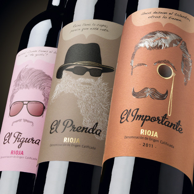
Bringing together seven Spanish wines selected from different regions of origin under the label Seven Steps.
Each wine label is differentiated with an identifying character. The illustrations are cool and modern and I'm sure each of us could happily choose one of these to take to the host of a party. I would be equally as happy to have all seven of these unique wines lined up in my wine rack! Designed by Calcco.
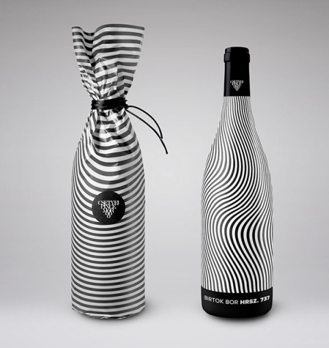
Csetvei Winery
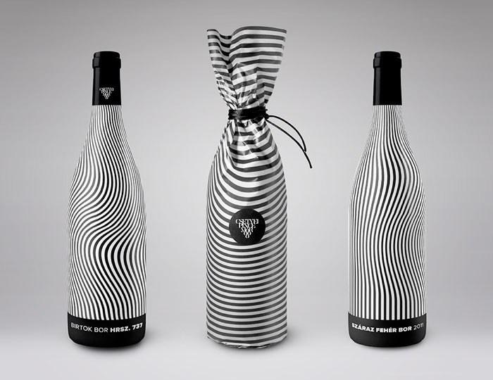
This creative packaging is designed by Kira Koroknai, Budapest. The striking design is a beautiful extension of the Csetvei Winery identity.
"With the black and white pattern, I wanted to reflect on the wine’s characteristic and full-bodied taste". The full bottle design instead of a classic label form hits you with full force and the wrap style packaging of the bottle is equally as enticing.
Kira wanted the bottle to become a part of enjoying the wine, creating a personal experience for the drinker to hold and turn the bottle around while having a chat.
Circus Wine
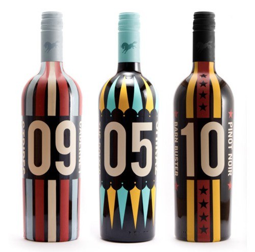
Bold, beautiful and creative! The influence of the circus can clearly be seen and makes this wine packaging bold, beautiful and playful. I can easily see how the consumer would be drawn into making a purchase above its competition.
Motif Wine
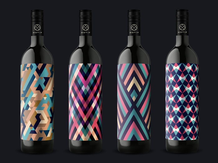
Another striking example of wine label design for those wine lovers who love color and patterns. The selection of German wines comes with its unique color pattern that represents each wine's taste and smell - a perfect motif.
Motif says "We believe the time is right. For a wine without many words. What we see, taste and smell, we write before anyone more. Therefore, there is Motif. Explained only by a name in the local dialect. And a pattern of color and form. A label, a word, a wine"
MOTIF fine art wine
Manaresi-winery
These wine labels are inspired by the Manaresi family's great appreciation of art which gave plenty of creative inspiration to design agency Dina&Solomon.
The original Manaresi, Paolo Manaresi, was an artist who had an incredible talent for engraving which is incorporated into the case design for the wine.
The bottle features a minimalist contemporary look accented with red, gold, silver and green caps. Each wine label of the 4 bottles has a different format and accent dot colour and the flagship wine has a golden dot matched by a golden capsule.
The Manaresi Winery packaging is art in itself.
Wyn
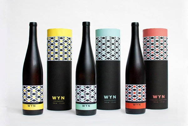
Wyn wine packaging is a great example of up and coming talent. This fictional wine packaging was created by design student Brittany Albertson. She created a fictional South African wine called Wyn, meaning wine in Afrikaans.
“I was inspired by the bold and striking colours that are used throughout South African art and architecture. I was also influenced by the amazing use of pattern in South African culture and the intricacy of those patterns.”
Brittany Albertson
BRND NWS Wine Label
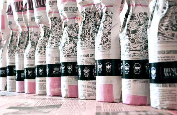
An absolutely perfect execution and example of self marketing put together by BRND NWS to present as a gift to loyal clients for Christmas 2011.
The packaging celebrates the Year's Marketing Headlines. The chronicle was set to regular newsprint and a bright salmon hued paper, coordinating with the bottle labels which are accented in fuchsia.
A thoughtful and creative gift that I'm only disappointed I can not purchase to add to my collection!
Reference : Lovely package
Let it grow
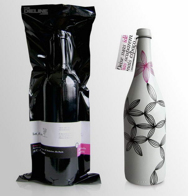
When designers are left to their own devices beautiful packaging is created. And that is exactly what happened when Brazilian design firm LetItGrow wanted to present their clients with a special gift. Packaging designers took 100 empty wine bottles, painted them white and then illustrated each bottle by hand! Each of the wine bottles were then finished in black vacuum-sealed plastic with a label describing its contents.
Reference: Pinterest
The Wines of the World range
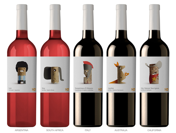
Spanish design studio Lavernia & Cienfuegos designed a range of playful wine labels from different countries of origin. Cleverly utilising a distinguishing feature from each country to emphasis the wines origin, designers used cork, dressed up in a original way with paper, to bring the character to life.
Every country has something that distinguishes it from another country. With this in mind and the use of cork, Spanish design studio Lavernia & Cienfuegos designed a range of playful wine labels. To emphasis the wines origin each cork was dressed up in a original way with paper. The Californian wine looks like a cowboy, the Australian wine looks like a koala bear and so on.
Paperboy paper wine bottle
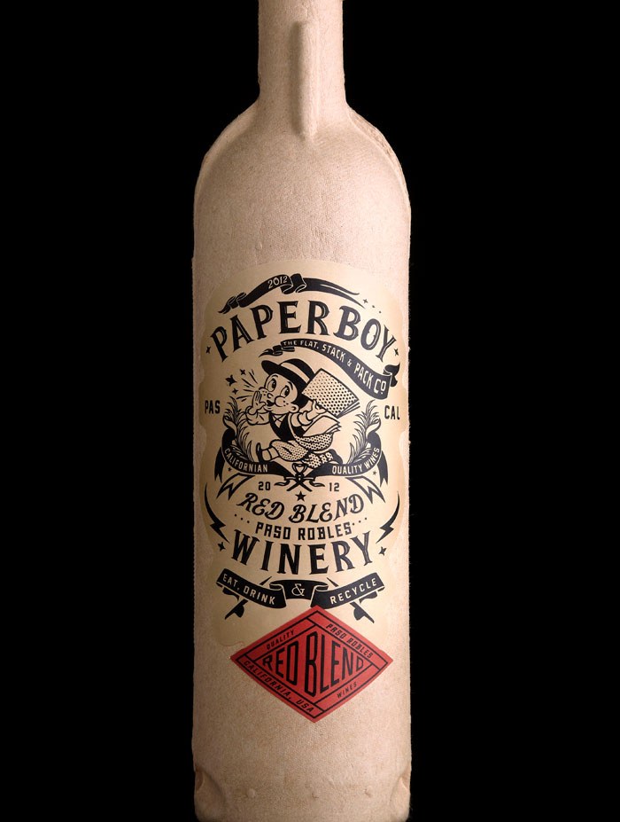
Design agency Stranger & Stranger do it again! Paperboy is a wine bottle made out of compressed recycled paper designed. And this is about as green as it's possible to make a wine bottle!
Made out of a compressed recycled paper, printed with natural inks and containing a recyclable sleeve on the inside the same as you would find in a box of wine.
The bottles are rigid and strong and can even be placed into an ice bucket for up to three hours without dissolving into a paper machete mess! Weighing in at only an ounce when empty this wine packaging certainly ticks all the boxes where energy and shipping are concerned.
And on top of all that, it looks stunning!