CB.Do
- Illustration/
- Animation/
- Creative Direction/
- Identity
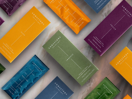
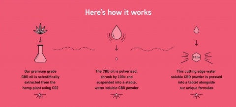
The world’s 1st multi-function CBD tablet, cleverly formulated with Nature’s best ingredients and made with patented water-soluble CBD powder. This cutting-edge technology is the first of its kind. Precisely dosed, more absorbable and faster acting Daily tablet. The world’s 1st multi-function CBD tablet, cleverly formulated with Nature’s best ingredients and made with patented water-soluble CBD powder. This cutting-edge technology is the first of its kind. Precisely dosed, more absorbable and faster acting Daily tablet.
Exclusive deal with selfridges within 6 months of launch.
THE STRATEGY
Our aim was to give clarity to a confusing market, allowing more people to try something that’s often overly complicated and intimidating. As this was a revolutionary first to market product we needed to bring something different to the saturated market of me-too brands.
THE CREATIVE
Our aim was to give clarity to a confusing market, allowing more people to try something that’s often overly complicated and intimidating. As this was a revolutionary first to market product we needed to bring something different to the saturated market of me-too brands.

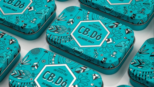
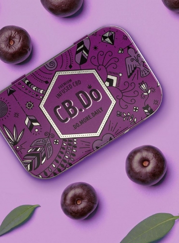
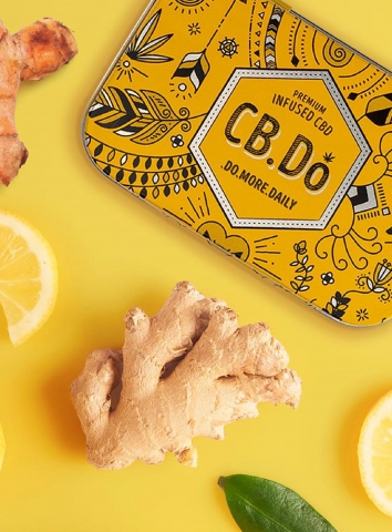
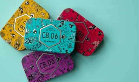
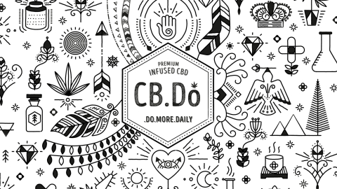
We wanted to move away from using direct hemp imagery as this can be a barrier to purchase. Instead we’ve taken inspiration from cannabis throughout history. The packaging is like a map, a journey through time. The hand drawn elements chronicle the use of hemp and natural ingredients by different nations in different eras but with common uses.

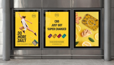
A SUPERCHARGED WEBSITE
Of course the website is the key to communicating the essence of the brand. We designed an immersive and engaging website to cut through this category. A bold colourful pallet combines with interactive ingredients and their benefits, creating call outs which are playful yet informative. The social media campaign follows this through with quirky images, bright colours and cool text layouts, making it fun and engaging.
THE OUTCOME
Launched in June 2021, CB.Do have seen growing success through their own e-commerce website, and after just 6 months have launched in Selfridges flagship store in London as well as their online store.