Creative Packaging Design Examples
Creative packaging design should allure, persuade, inform, wrap and protect an item. It’s not just about attractive aesthetics, but good packaging must clearly convey essential information to allow the consumer to make an informed decision while still being highly distinctive. Consumers judge not only the quality of the product but its packaging design. So in such a crowded market place its important to give a product a unique edge.
Below are some excellent examples of communicative and creative packaging designs.
‘Grown’ Organic Skincare Packaging
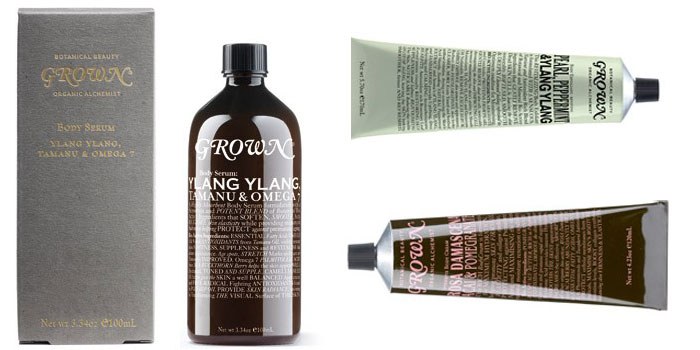
Grown is an Australian skincare company that prides itself in bringing botanical beauty products to everyday life and have developed a beautiful line of packaging to compliment their products. Much thought has gone not only into the products themselves but also the primary and secondary packaging. The result is attractive and communicative packaging design which clearly portrays Grown’s natural and sustainable ethos.
Røkeriet Packaging Design
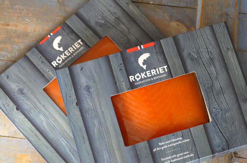
Røkeriet is a fish smokery in Bergen on the west coast of Norway. The packaging design for their smoked fish clearly conveys the natural, hand crafted methods they use to smoke their fish. The muted and weathered imagery of the wood enhances the colour of the product which can be seen through this visual packaging. I can almost taste the salty air and feel the brisk wind against my face. I love it, simple and clean.
Tea India
This gorgeous creative packaging design solution for ‘Tea India’effectively communicates the union of tradition and vibrancy of modern India. Launched into the UK market, this packaging captures the energy of India, with the teapot bursting with flavour to convey the deliciousness of these teas. The dark background with the vibrant colours of the delicate illustrations sitting on top gives clear product catagorisation. Embrace brands have done a great job and the result is unique and creative packaging designs which conjure up the taste of India.
Creative packaging Design for JJ Royal
Question: How cool is coffee becoming?
Answer: Seriously cool!
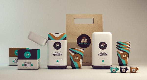
There is huge growth within the coffee industry and immense competition but with packaging designers creating brand packaging like JJ Royals they will certainly sit high above the rest. The use of colour is sumptuous and the flow of the stripe symbolising the pouring of coffee is lovely. Clean, modern branding, great creative packaging, cute little espresso holders and my heart goes flutter. Somebody send me a sample!
Truett Hurst x Safeway
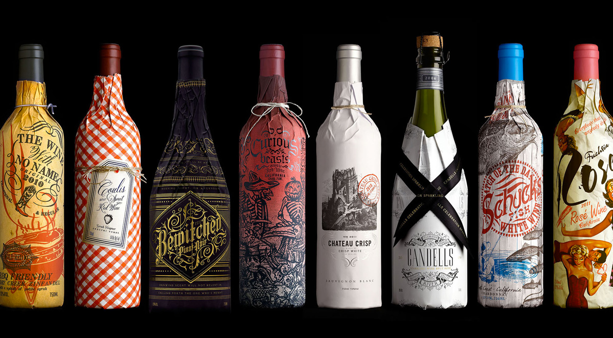
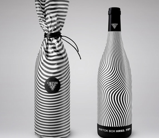
As packaging designers our ultimate goal is to encourage consumers to purchase and use the product. It doesn’t really take a rocket scientist to work out these wines will have great shelf appeal. Wine label packaging has come on in leaps and bounds and there is already a vast array of stunning and beautifully designed wine label packaging on the shelves today. However what I really like about safeways new line up of wines is the texture this packaging adds to the shelves. The way in which the packaging wraps the bottles make the products stand out and consumers will be more inclined to reach out and engage with the product. Individually the creative design of each wine is well executed, however, collectively as a line up the impressions is even more powerful on shelf.
Blossa ‘glögg’

The annual ‘glögg’ (Swedish mulled wine) from Blossa celebrates 10 years. The minimalistic East Asian inspired packaging design is refined and contemporary. I love the simplicity of the brushed ’12’ with the red stamp to add authenticity and the result communicates elegance, on and off the shelf.
Typographic Packaging Design
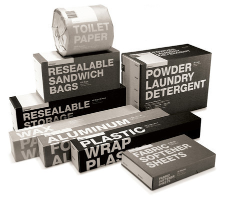
These typographic driven, no nonsense packaging designs are loud and to the point . The title of each product is emphasised and it clearly communicates what is inside without revealing too much unnecessary information. The simple neutral palette distinguishes the products from one another. The result is modern, visually engaging and communicates the packaging to be ethically minded.
Heineken Cube (Packaging Concept)
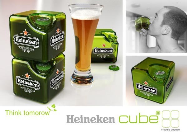
Designed to overcome the loss of space between the cylinders of beer, Heineken Cube optimizes storage all along the chain: from manufacturer to consumer. Although this is still a concept its great to see Heineken are trying to address the sustainability issues. This creative packaging design generates significant fuel economy during transport. I am not completely convinced about drinking from the square bottle but I’m sure if it went into production there would be plenty of consumers ready to give it a try, if for no other reason than its ‘how cool do I look’ appeal.
Perhaps if I got to try a few dozen samples I’d really like it!
