Stand out Men’s Grooming Brands
Male grooming has always been a ‘thing’, but it has never really been mainstream except for the more obvious products such as razors and associated items. Deodorant, too, is at the fore – even though they seldom take themselves seriously; often aiming for the ‘lad’ market, rather than the more mature male. This trend is changing though, as can be seen from our selection of some the best product packaging designs for this particular market.
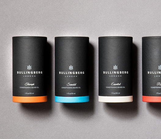
Bullingberg Grooming
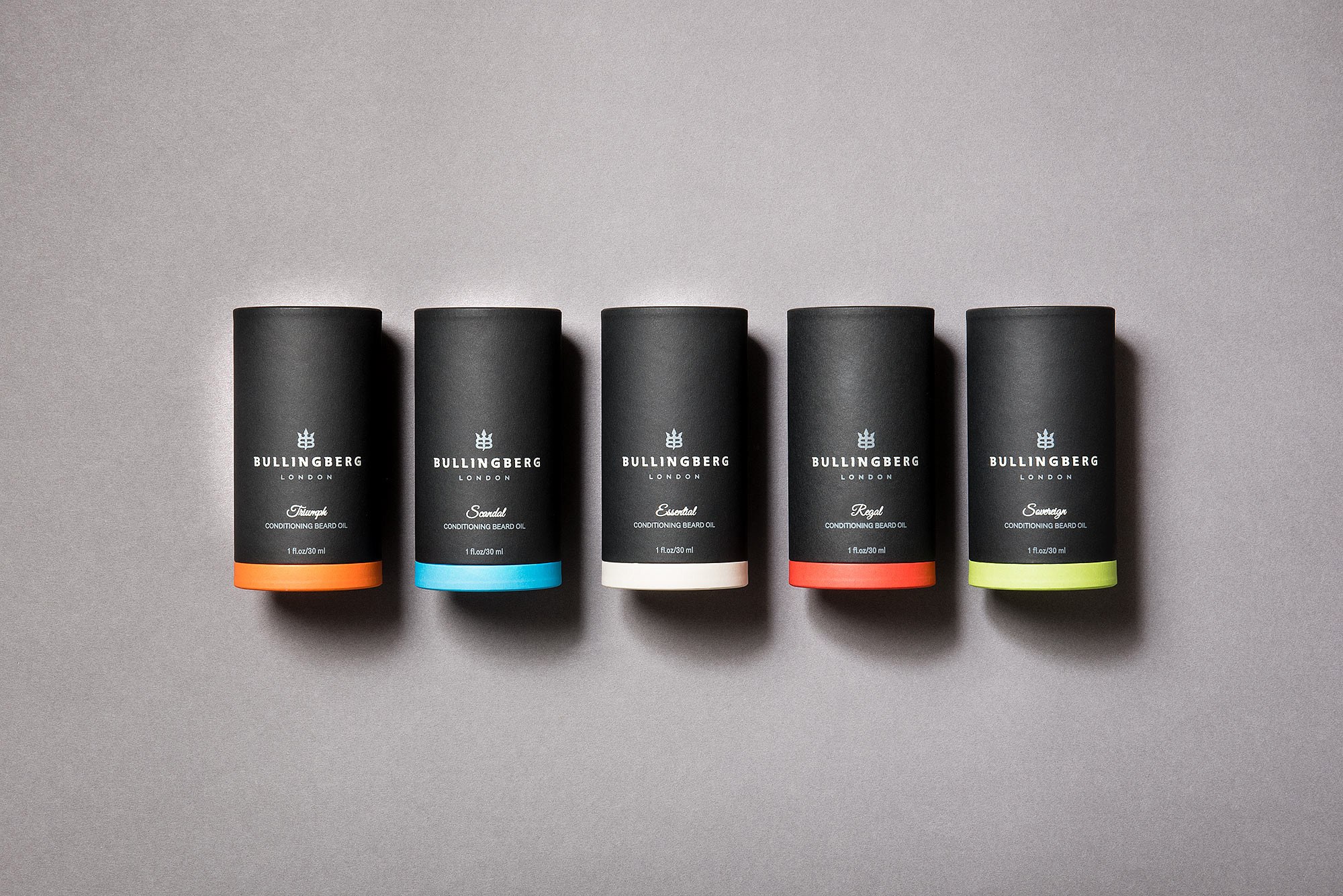
Bullingberg proudly represent the modern man; complex and three-dimensional, with the grounded style and irrepressible drive of a Conor McGregor or a Tom Hardy. We developed clean and precise brand packaging, with a range of five striking and modern colourways to represent the individual beard oils. It’s a design that looks just as eye-catching in an office as a gym locker. View the full Bullingberg case study.
White Key
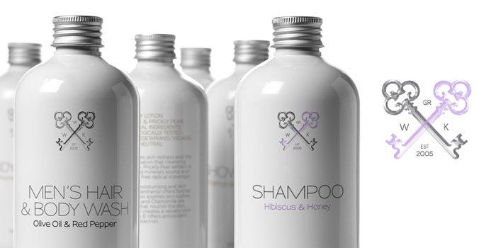
Clean lines, simply decorated and the high quality bottles used are reminiscent of the beauty parlours and pharmacies of the 19th and early 20th centuries. The coat of arms, the main piece of which consists of two white keys, is made up of the company initials, with the year and place of the companies inception. The more modern, elegant, writing style brings the range nicely into line with the image a modern man may wish to convey; style, comfort and strength.
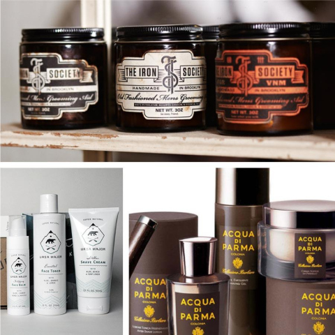
The Iron Society
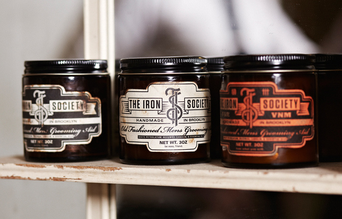
A private gentleman’s barbers, The Iron Society focuses on the clean, classic yet modern look of today’s well groomed man. The services offered, as well as the grooming products, are the epitome of cool – with styles such as the “Tony Bennett” a part of the range, you know you are in for something special.
The product packaging, and the barbershop as a whole, is highly reminiscent of 1930’s Chicago – not so much for the violence of the time, but the undisputed style and masculinity that a traditional barbershop such as this can bring.
Getting the packaging right, for this kind of product, is absolutely essential and the design agency has absolutely nailed it here.
No. Men’s Grooming Product
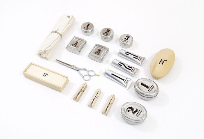
Clean, clear and evidently masculine. This packaging, like our first here, is aimed for the no nonsense end of the male grooming market. Each product type is identified by a number, rather than a name, making them easily identifiable and to mark out which product can be used in conjunction with another.
This system is slightly reminiscent of model planes, placing part ‘A’ with part ‘B’ – something most men can relate to immediately, and identity with happily.
No. Men’s Grooming is not just wonderfully packaged, it is excellently marketed through it.
Anthony: Logistics For Men
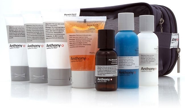
No frills, no flowers and no fluff. This product range is aimed very squarely at the alpha male market and the packaging reflects that perfectly – if a little subtlety.
There is product description, right there on the packaging, that is so straightforward and to the point it almost aggressive, with the mock scientific information providing the comic relief.
This a product line, thanks to the packaging and the packaging design agency responsible, that is immediately identifiable as being for men, by men. No ‘metrosexual’ nonsense here – leave your manbag at the door when you approach this line.
Niven & Joshua X Conran
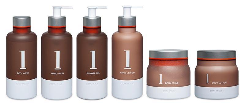
Simplicity. That’s the undisputed goal of the packaging design here, and it is something that works very well for many people – not just men. The white lettering, bases and nozzles contrast excellently with the dark, yet neutral, colouring of the rest of the container making everything very clear and easy to read.
Baxter of California
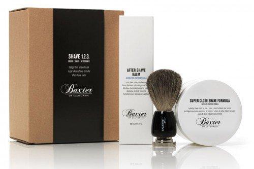
A good quality shave kit is hard to find these days, but Baxter of California really do know their stuff. The packaging used here reflects that, with the kind of sharp and confident visuals that one would expect from, and associate with, premium quality products.
There is no fuss or over selling here, it is not required. The packaging is as refined as the gentleman these products are aimed at – gimmickry is not necessary, or required.
Acqua Di Parma
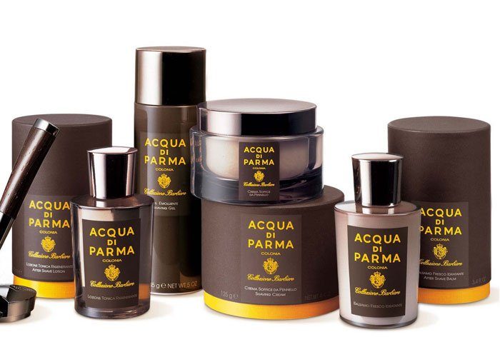
Refinement in glass form. The pinnacle of luxury in male grooming, Acqua Di Parma products (thanks, in large part, to the packaging design) are considered to be among the finest in the world. Unquestioningly stylish, and featured in Jude Law’s ‘Alfie’, this product line goes hand in hand with the charming and refined that it is oh so clearly marketed for. And why not? Bring on the martinis and the Casino.
The fragrances and the packaging are still both hand-designed, and Acqua di Parma is an iconic symbol of the refined, exclusive, and purest Italian lifestyle.
Bulldog Natural Skincare
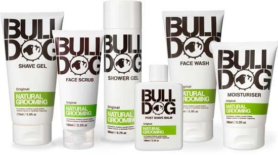
Man’s best friend – Bulldog Natural Skincare. The slightly rough and ready packaging imagery makes this the ideal gym partner, for those slightly self conscious when it comes to grooming products in front of the lads.
The packaging design agency at work here, has gone with a tube style of container, which is actually rather slick when compared to some other products on the market. This style would appeal to the ‘out and about’ portion of the market, as they do not take up a disproportionate amount of space in your gym bag or rucksack.
Manatomicals
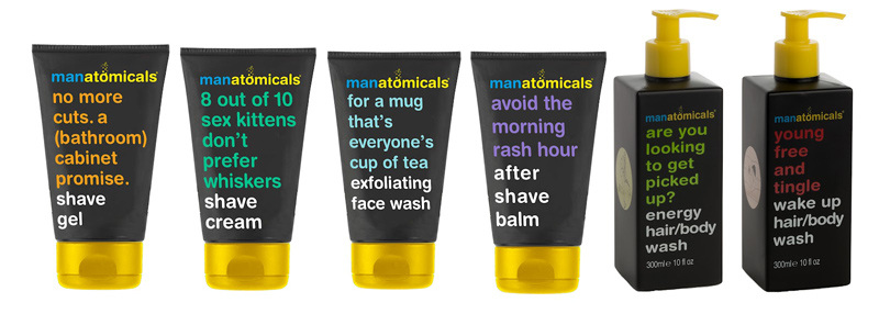
The quirky packaging is obviously geared toward attracting the younger portion of the male grooming market, the ‘lad’ demographic. There is something refreshing about this packaging design approach, a simplicity and honesty that is hard to dislike.
Bold colours and easy one hand operation make for an attractive sight on a bathroom shelf.
Ursa Major Skincare
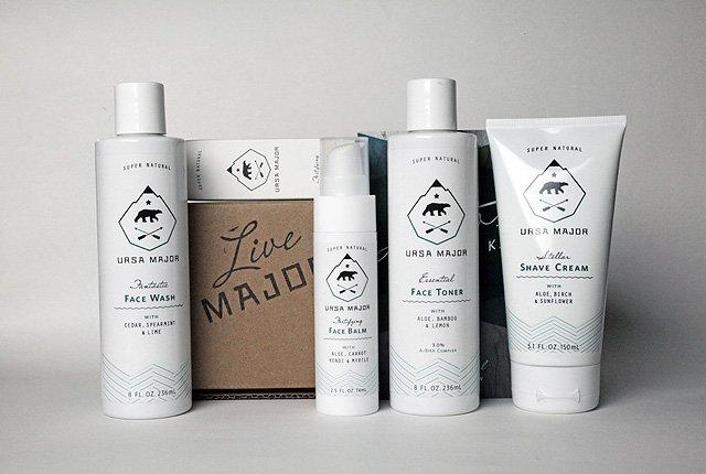
The clean, northern American themed packaging is as masculine as can be – after all, what says big and powerful better than a hulking great bear with teeth bigger than your head?