Food Packaging Design Inspiration
Food package design comes in all manner of different styles, including those that go to lengths to portray the contents in the most descriptive way possible.
With that in mind, our first offering is from Harvey Nichols – Now, can you guess what it is yet?
Harvey Nichols Christmas Hamper
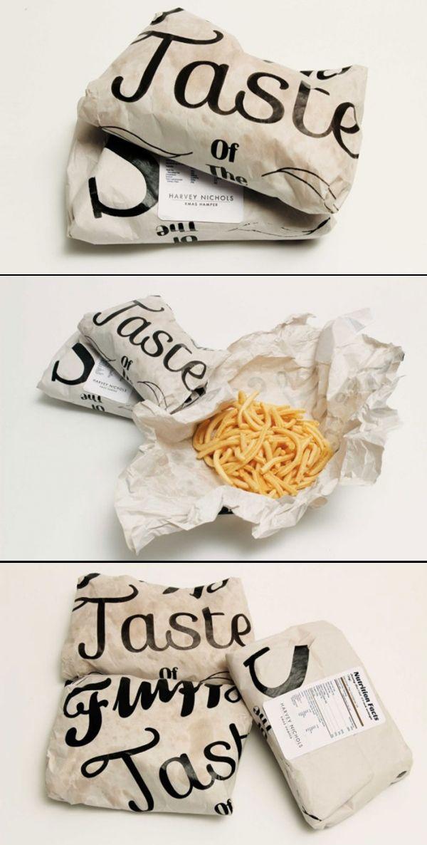
When you think of traditional fish & chips, where does your minds eye take you? The seaside, the chip shop around the corner? More often than not we are immediately reminded, even before those two, of greasy paper and even newspaper (even though you would be hard pressed to find somewhere that still used newspaper).
The Harvey Nichols Xmas Hamper contains, among other things of course, a fish & chip meal. As you can see from the image, the package design team has opted for the traditional theme to present this very British meal. The paper used is even designed to soak in the oil and grease, to give it the most authentic feel possible.
Barrelhead foods
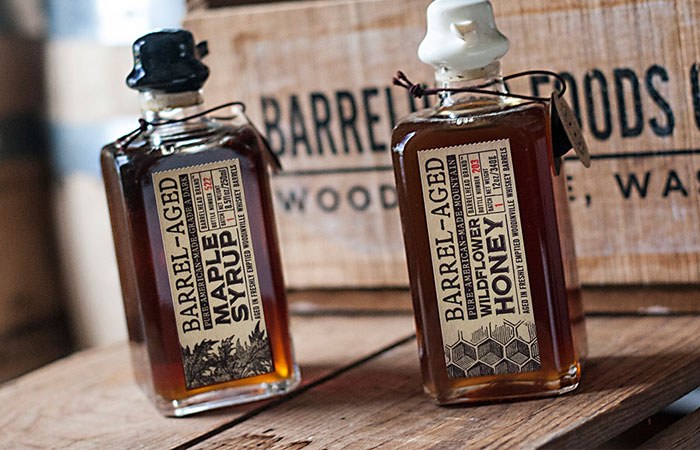
On initial inspection, there doesn’t seem to have a great deal effort put into the designing of this product packaging – but was any needed, really? The open view of the contents allows the deep, naturally beautiful colours to flow through the glass.
The understated imagery at the bottom of the label is the perfect accompaniment to the open style of the labelling in general, and the warming effect would not be same had the glass been opaque. Where does the term ‘barrelhead’ come from? In this case, it is a reference to the ‘straight to the point’ labelling used on whiskey barrels – something the designer has clearly taken into account when designing the rest of the label.
Novel butcher packaging
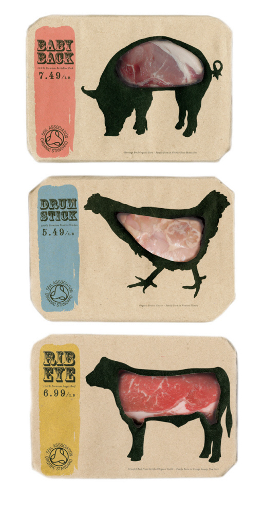
Food Packaging Created for Novel Butcher - 'to the point' food packaging design inspirationThe entire point of great packaging is to capture attention, fire the imagination, provoke an emotional response and ultimately close the sale. The packaging you see above certainly ticks all the right boxes in terms of grabbing the shoppers eye and gearing up their imaginations.
Some may find the design too provocative, but there is no denying its straight talking honesty.
Extrem Puro Extremadura
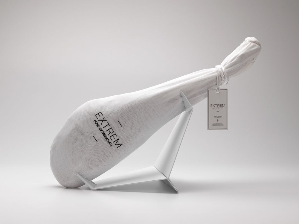
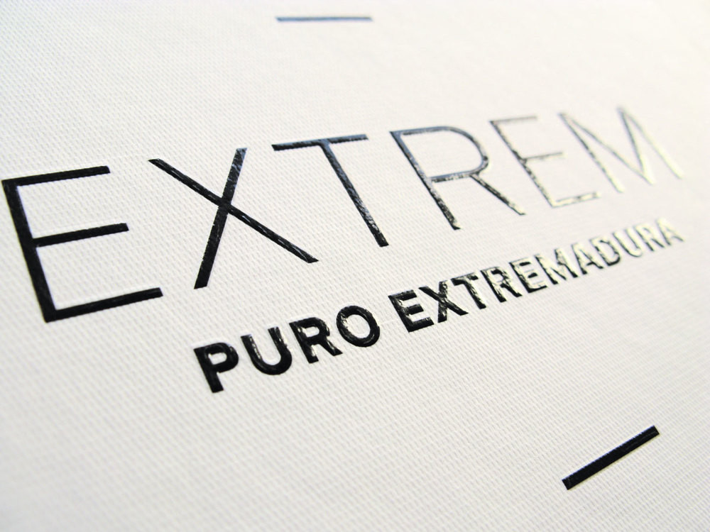
From the blunt, to the outright beautiful. One would be forgiven for thinking that luxury chocolates or perfumes were concealed within the folds of these packages, and not meat products. That said, perhaps the shape of the contents, so beautifully wrapped in textured cloth gives it away!
To paraphrase Coco Chanel, luxury is the absence of vulgarity. The packaging designer has taken this idea and set off with it in leaps and bounds. The minimalism, and clinical look of the design is in stark contrast to the nature of the actual contents. This is luxury packaging at its finest.
Hexagon Honey
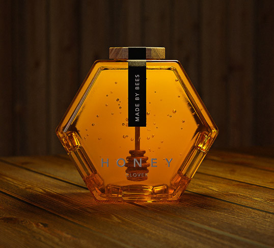
When it comes to functional design, Hexagon Honey may just have the competition beat. Thinking of honey, your mind may wander to bees (and why wouldn’t it?) and the hexagonal honey storage cells. The genius design of this packaging doesn’t end with the mere shape, as the packaging designer responsible was only getting warmed up. Attached to the underside of the lid, can be found a rather attractive honey dipper – making it overall not just even easier on the eye, but easier to use too.
Hexagon Honey is even retailer friendly too, being as easily stackable as they are.
Cartwright & Butler
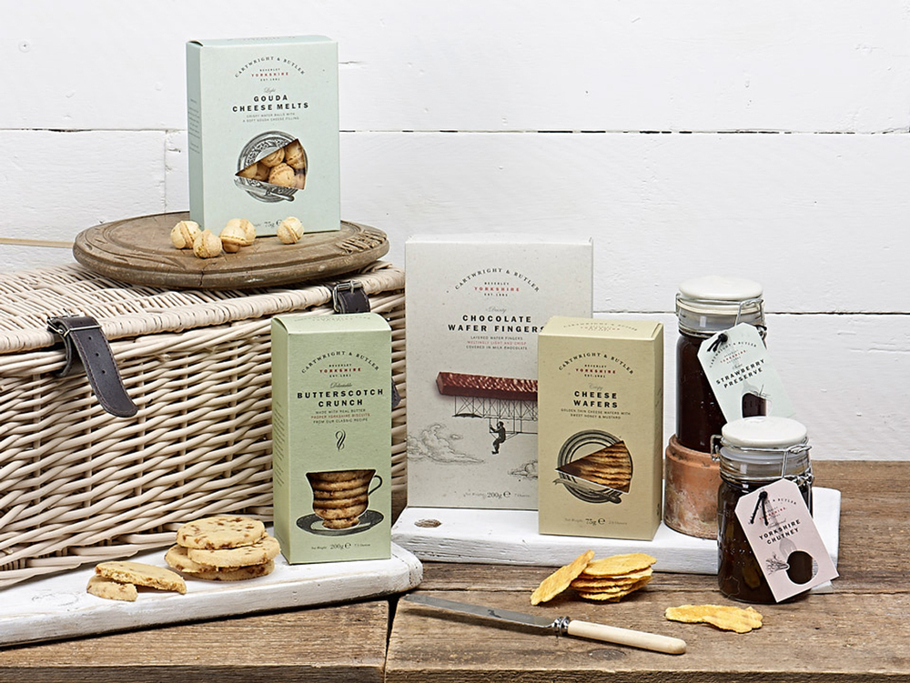
Opting for a more traditional look, the designer has gone for very memorable package choices which can only invoke the fondest of memories in anyone that is familiar with homemade preserves. This was, of course, the entire point in choosing kilner jars as containers, as Cartwright and Butler themselves started life in a small rented room in, in a coastal Yorkshire town… at least, their products did.
As the brand became ever more popular, their brand became more expansive. It was at this point that they realised that a rebranding, to reflect their wider product range, was needed.
Salsas Tumbao
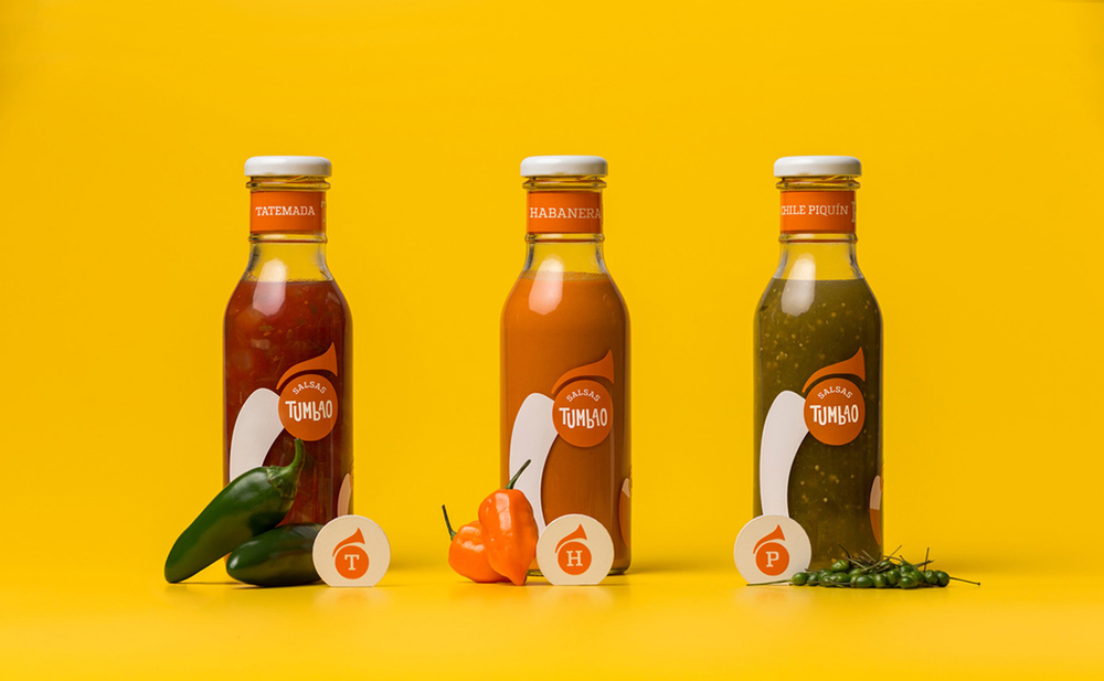
Tumbao is a basic rhythm, which is played on the Bass – and so the name was chosen, for these salsas, to reflect the rich Salsa music history of Mexico (where the design agency hails from). In keeping with the music theme, the logo of Salsas Tumbao is a silhouette of a brass wind instrument.
The earthy colouring of the labelling is a nod to the country of origin, also, and is an ideal match for the deep, natural colours resonating through the clear glass.
GAEA Oil & Vinegar
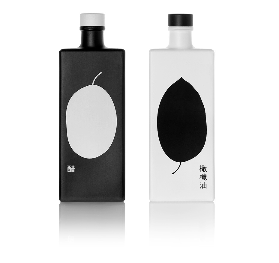
From the image alone, you would be forgiven for thinking that you were looking at a chic perfume or shampoo set. You would also be forgiven for thinking that this was a dyed in the wool chinese product, for the chinese market.
The GAEA company, however, is firmly rooted in Greece, and had this gift set specially designed for the Chinese market (the Chinese people do appreciate fine Greek vinegar and olive oil). Cultural references always help, and it is no different in this case – the Yin & Yang reference being plain to see, with the two halves being made up of the contents organic origin.
Raselli organic herbs & blossoms
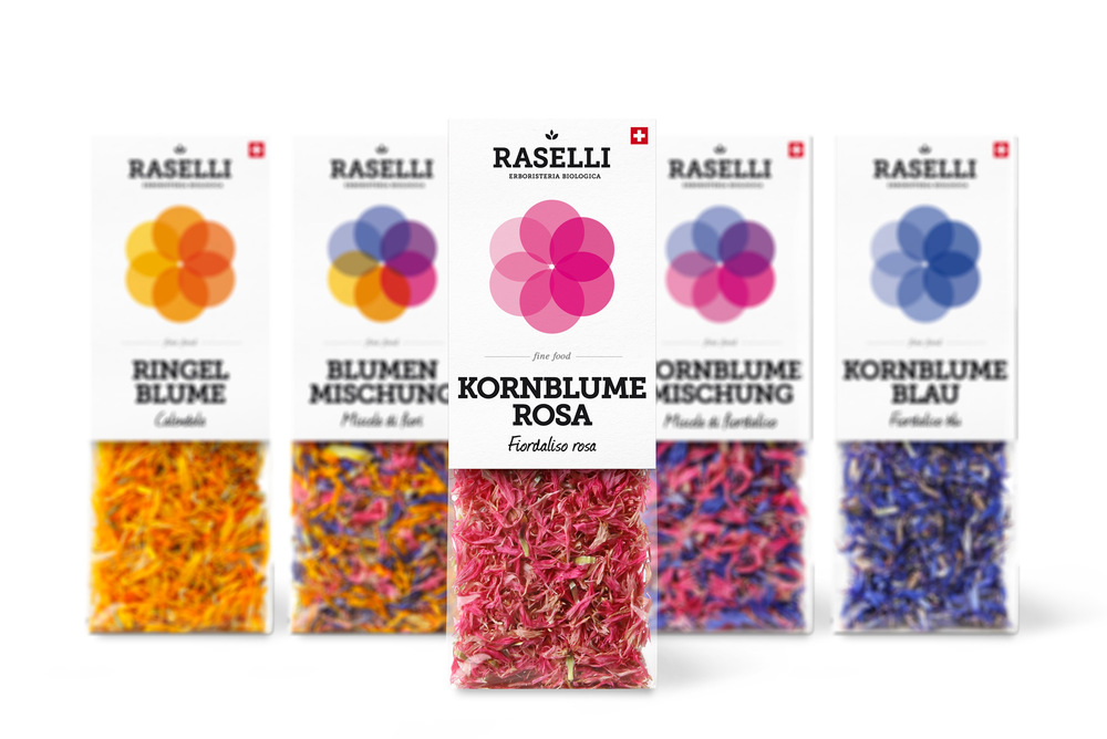
Emphasising the natural beauty and colour of the product was an obvious consideration here, when designing the packaging for Raselli.
The herbs and blossoms themselves are put to good use, with clear materials being used on the lower half so the colours can radiate out from within.
Legacy Roasters
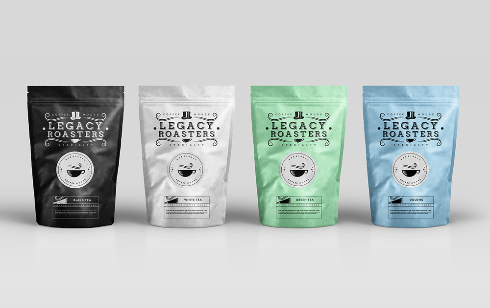
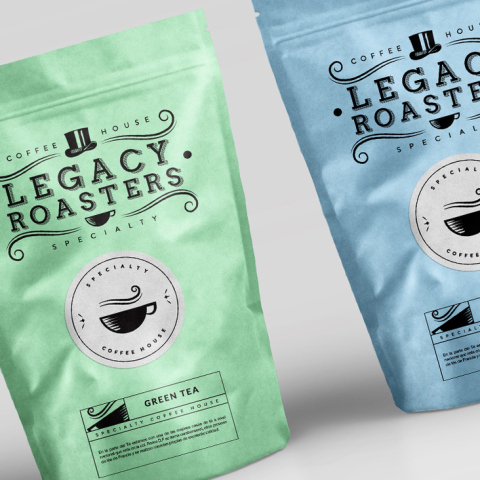
Legacy Roasters full line up of Tea Packaging Designs
Speciality tea and coffee, require speciality branding and packaging. Right? That’s what the design team responsible for the branding here thought, and they wouldn’t be wrong either. Rice paper packaging, for both the tea and the coffee, together with ziploc fastenings help to keep the contents fresh and lock in the flavour of the Legacy Roasters tea and coffee. In keeping elements from the old branding, the design team managed to keep the authenticity and heritage of the product alive; the top hat, for instance, is still there as is the word ‘legacy’.
The end result is a more contemporary design than the previous outdated packaging, and no doubt the products concerned are much easier to store.
