You, Me & a Cup of Tea
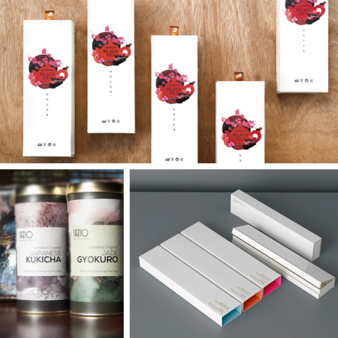
Packaging design can be a tricky beast at the best of times and tea packaging is no different, even if the product itself can define an entire nation. Like many well known household products, tea brands are instantly recognisable – as it should be, really, considering the amount of time and money spent on branding. There are brands though that are equally deserving of at least being given the taste test and some of the packaging designs are far from ordinary and ‘just another’ tea option.
Here, we would like to bring to your attention 12 of the best tea packaging designs that we have come across. So, in no particular order, here we go:
Normann Copenhagen
Probably better known for their range of minimal home furnishings, Normann Copenhagen (in Denmark, funnily enough) have taken the unusual step, for a home furnishings company, into consumable design. A collection of 12 teas have been released in reusable tins, colourfully designed by Anne Lehmann, the leaf-shape inspired designs serve to highlight the contents and the individual blends of the loose leaf teas.

Just T Milk Tea
Milk Tea, specifically the types from Just T, come in two varieties – a ‘regular’ black leaf tea prepared with milk in a Cafe Latte style (very creamy, little foamy on the top) and a variety that is blended with aromatic ingredients like pepper, cardamom and cloves. The reusable tins that the teas come in are as elegantly understated as the teas themselves. Numbered according to flavour, for easy identification, the tea packaging design ideas for each blend are straight to the point and minimalistic. This is not to say they are dull, however, as each design is uniquely attractive.

Sazio
Michele Alise was hired by the the Japanese-Italian founder of Sazio (Italian for ‘sated’) to design the packaging for Sazio’s line of speciality teas. The hand painted artworks that feature on the packaging labels are watercolour studies of textures and colours found in nature and build upon the heritage and life of the founder. Heavily reminiscent of the Italian and Japanese countryside, the chosen colours and textures of the design really bring the design to life. At the same time, the Japanese influence is still clear to see, bringing everything together and making the design as a whole little works of art in their own right.

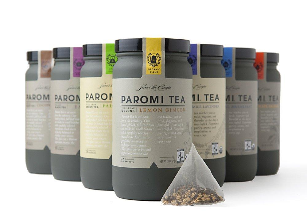
Paromi
The R/West design company was approached by the Paromi Artisan Tea Company in their quest for a total brand overhaul. Although the products they offer are unique as well as premium, the brand itself lacked that all important ‘shelf presence’ – which is kind of important if you actually want consumers to notice your product. The packaging R/West designed literally tells the story of Paromi’s global search for the perfect ingredients.
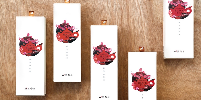
Alishan Tea
Taiwan based branding and design studio, Victor Design created this beautiful packaging design for Alishan Tea with local culture and art stylings very firmly in mind. The contrasting colours bring out the soft lines against the stark backgrounds perfectly. Reminiscent of premium quality perfumes rather than tea (most definitely not a negative considering how aromatic tea can be), the packaging very much conveys the feeling of superior quality and it can hardly be denied that this design has a shelf presence to be envied.
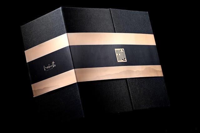
Qin Sheng Breeze
The deep black of the background highlights the black the longan coal traditionally used to bake the tea. As well being deeply symbolic, the background also perfectly presents the rest of the unique design, representing the strong work ethic of the original master. A slightly raised texture lends a very tactile quality to the design, almost feeling as the holder can feel the history and depth of the contents and the ground that it came from. Qin Sheng Breeze is a tea with an exquisite tea with a design to match.
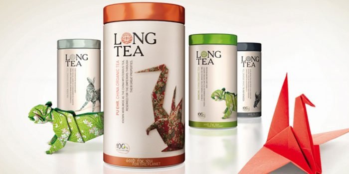
Long Tea
The Long Tea range, from Next Food, package design is based around the telling of its very own story – like many creative and captivating packaging designs. The story itself is told via the text and the beautifully detailed illustrations.
“LONG means Dragon. The dragon is the most ancient insignia that is known. The oriental dragons live in the water and symbolize the supreme spiritual power: the earthly and celestial power, the knowledge and the strength, and therefore they are benevolent, providing health and good luck“
Teabox
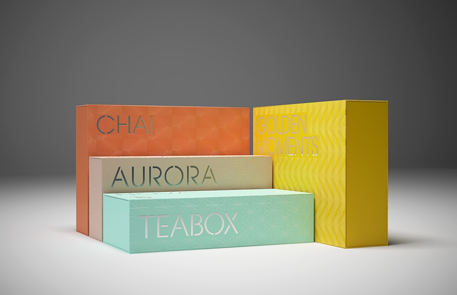
There is no risk of forgetting what this company makes, and it certainly makes the brand easier to remember and stick in the mind. A perfectly recognisable, distinctive monogram is formed from the letters T & B. The minimalist approach of the Teabox design matches the rest of the packaging and this carries over to the website, also – being an ecommerce tea business it was important that the physical and digital branding blend with one another to create a smooth continuity. Different colouring for each boxes distinguishes the tea blends from one another, making it a simple task to find the one that you want.
Jiangan Beauty Tea
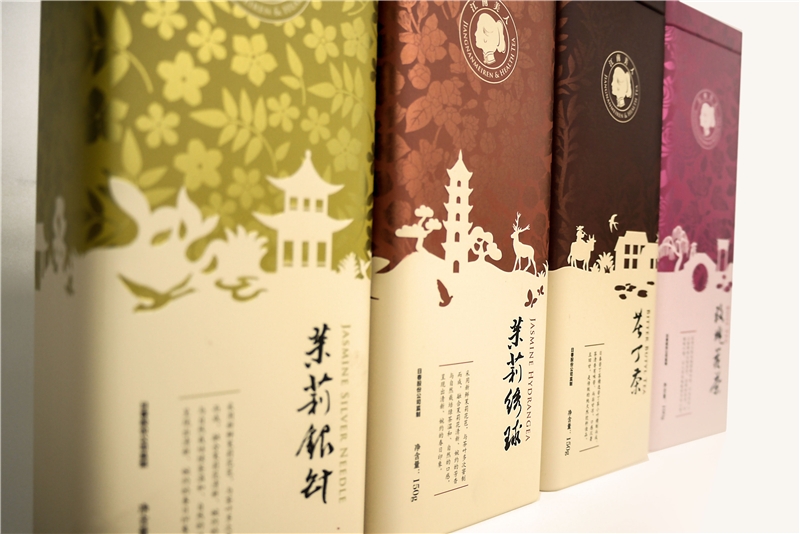
Mirroring the earthy and seasonal tones of southern China, the design of the packaging for the Jiangan Beauty Tea range displays a 2D diorama-like scenes of of ancient China. Telling a story through imagery is nothing new but it is not too often that as much thought goes into it as this. Placing the various packages side by side, in the right order, displays a larger design story. Earthy and natural shades combine to create a truly beautiful and innovative work of art, ‘masquerading’ as packaging
The best tea time of the day
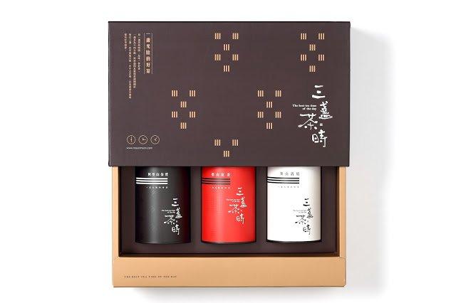
Apparently, the perfect length of time to take tea is 14 minutes – evenly spaced over the day, three times. Fourteen minutes is just enough time to gather one’s thoughts, unwind and contemplate the day that just happened or the day yet to begin. Stark horizontal lines coupled with strong geometric shapes give a depth and strength to the packaging design that would otherwise have not been possible. The idea of the three cups of tea is interwoven into the design itself, reminding us all to just sit and relax.
Yauatcha
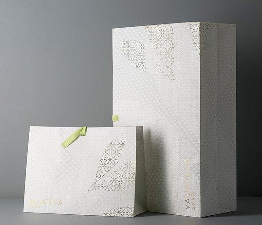
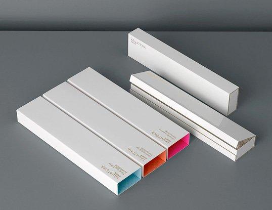
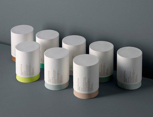
Beautiful yet amazingly, deceptively low key design is the order of the day and the love of soft pastels is very much in evidence. Yauatcha is an upmarket dimsum restaurant, as well as elegant tea house. The design ethos and gentleness of the restaurant / tea house been carried over to the tea range design packaging in fine style. The obvious care and attention that has gone into the design of the package itself has not been forgotten for the decorative take home bags either. As minimalist as the design is, it is still powerful enough to lodge itself firmly into the memory.
This is a collection of our favourite package designs, rather than our favourite blends of tea. Each design has something to say, has come from a different angle and is unique from one to the other. Which one was your favourite? Is there a favourite design of yours that didn’t make it to the list? Let us know.
This is a collection of our favourite package designs, rather than our favourite blends of tea. Each design has something to say, has come from a different angle and is unique from one to the other. Which one was your favourite? Is there a favourite design of yours that didn’t make it to the list? Let us know.
