The Changing Face of Whiskey Packaging.
You would recognise a bottle of Whiskey from across a crowded room, wouldn’t you? After all, when it comes to design, there is not all that much to distinguish one from another – traditional designs and packaging have become almost as well known as the malts themselves, with many brands relying on familiarity and brand loyalty.
The following then is a breath of fresh air, for the whiskey lover in particular…
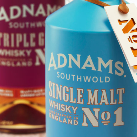
Adnams
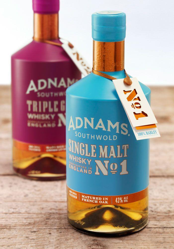
The Adnams branding is about as far removed from the ‘traditional’, as it is possible to get with whiskey.
Adnams English, handcrafted, single malt is stylishly presented in the kind of striking way that is not likely to be forgotten, or go unnoticed.
This contemporary design is very pleasing on the eye, with the soft colours providing a welcoming overcoat for the strength which lies inside.
Bib & Tucker
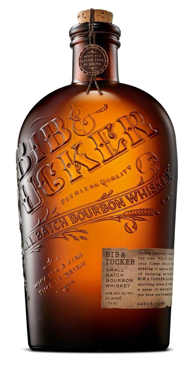
Going in completely the opposite direction as Adnams, Bib & Tucker takes it’s primary cue from a bygone era. The term, Bib & Tucker, would mean your finest clothing, or your Sunday Best – and this is where the design team took their inspiration.
One cannot help but picture dusty saloons, complete with piano player, when looking at the extravagance of the Bib & Tucker bottle; and perhaps that’s the point?
Simpler times, for simpler folk and a drink that was made for savouring. Bib & Tucker sure does look mighty dapper with this design, and there we have to say – mission accomplished.
The Original Moonshine
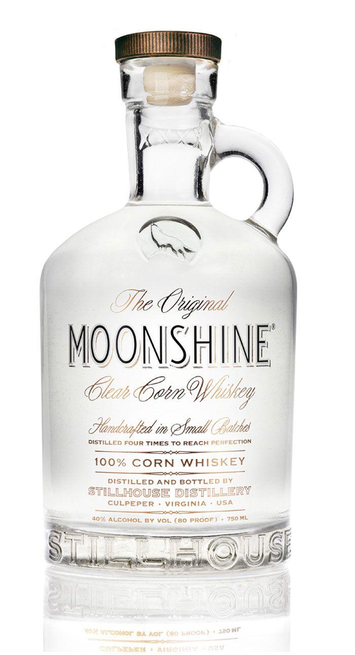
When we think of moonshine, a lot of the time our minds may conjure up images of the American south and the Louisiana bayou.
The laid back sedentary lifestyle, that these images are reminiscent of, are reflected in the clean lines of this elegant design.
Moonshine has been distilled in copper pot stills for hundreds of years, and the traditional design on show here serves as a reminder that this Original MOONSHINE knows exactly where it’s roots are.
Migrant Scotch Whiskey
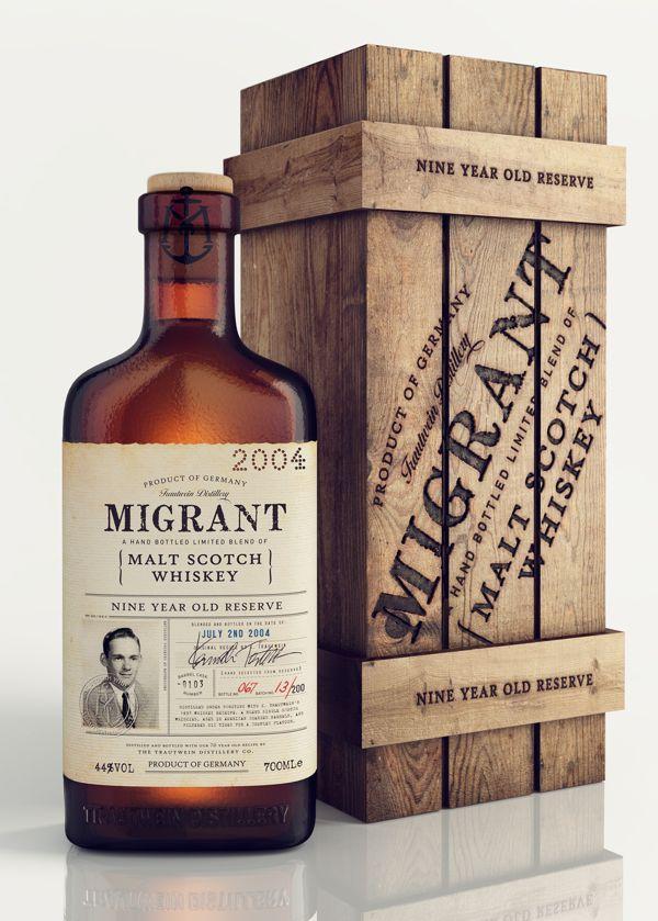
“Multicultural” springs to mind with Migrant whiskey, and why wouldn’t it? The whiskey is made using Scottish blends, aged in American oak and is distilled in Germany…
One would be forgiven for wondering if Migrant whiskey had a passport of its own, and you wouldn’t be far off the mark of you did.
The packaging design was inspired by the travels of 1930’s migrant, a grandfather of the German company (Trautwein Distillery Company) behind the whiskey. The photograph used on the bottle, was lifted from Ken Trautwein’s passport.
Bull·a·rook Australian Whiskey
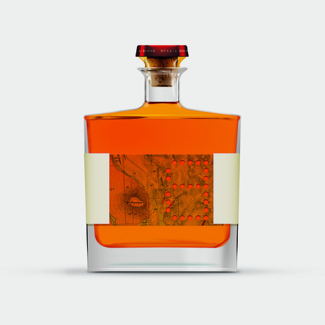
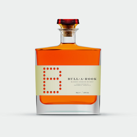
Even the name sounds Australian, doesn’t it? Bull-a-rook Australian whiskey is just as unlikely sounding as Australian Champagne, yet they are both very real and tremendous fun.
Fun? The rear of the label hides a layered map, which can be viewed from the back of the bottle. Although reminiscent of an decanter, this minimal design is actually quite pleasing to the eye – soft contours, clear typeface – even the whiskey itself is a part of the design, with it’s glowing colour lighting the bottle from the inside.
Sinning Hand Whiskey
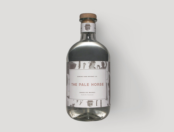
Jumping back to the American South, we have Sinning Hand Whiskey, with a unique design reflecting all that the North American South is famous for – from haunting Gospel, to soulful jazz and not forgetting the ever present Voodoo ‘vibe’ and masquerades that the south is known and loved for.
Pale Horse is a limited run of ‘young’ rye whiskey, and is the debut run of Sinning Hand Whiskey
Balvenie 50
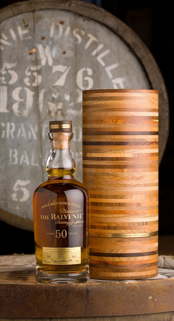
When we think of whiskey, we can’t help but think of Scotland – whiskey from anywhere else just doesn’t feel the same for many people, and they will very often seek out genuine Scotch.
Balvenie can never be mistaken for anything other than Scotch Whiskey, with everything about it screaming ‘tradition and ‘Scottish’. Aged for an astonishing 50 years, and in runs of just 88 bottles, you could safely call the Balvenie ‘rare’.
Simplistic in design, the dark gold colour is allowed to take precedence over the minimalistic labelling. The bottle is presented in a cylindrical case which is made up of 49 rings, coming from 7 different Scottish grown woods. To finish off this beautiful presentation piece, the case is finished with a layer of brass, reflecting the fixtures and fittings of the distillery stills.
John Walker Diamond Jubilee
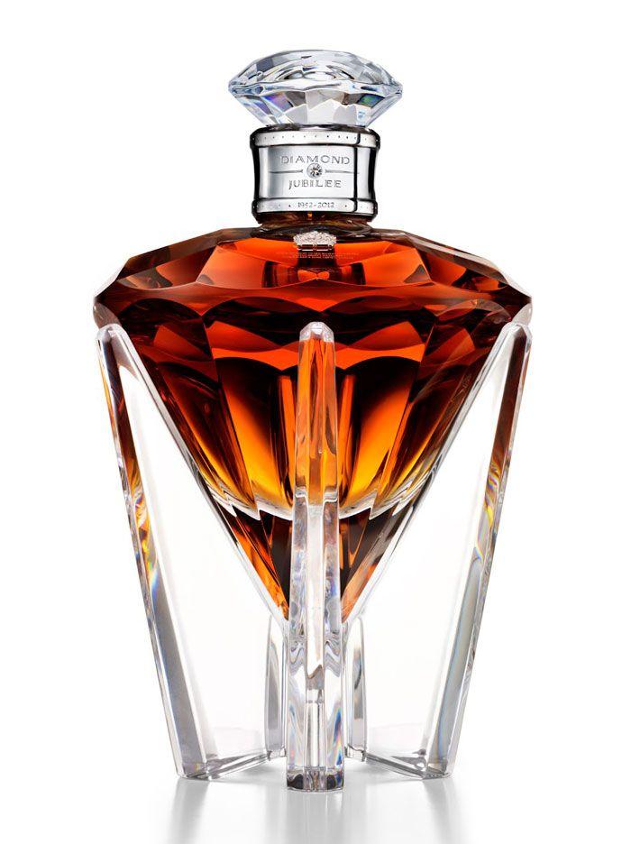
Released to mark 60 years of Her Majesty’s reign, John Walker Diamond Jubilee is made up of specially selected malt and grain Scotch whiskies, distilled in 1952.
The design of the bottle is nothing short of astounding, with everything about it quietly purring class, premium quality and style.
Dark amber liquid positively radiates from the bottle, the angled contours allowing the colour to glow vibrantly under even dim lighting. A half carat diamond accompanies the casing for this, what can only be called a work of art, and also carries the numbered seals (each is numbered according to it’s bottling order, a total of 60 bottles), the royal coat of arms and the John Walker & Sons monogram.
Balblair whiskey
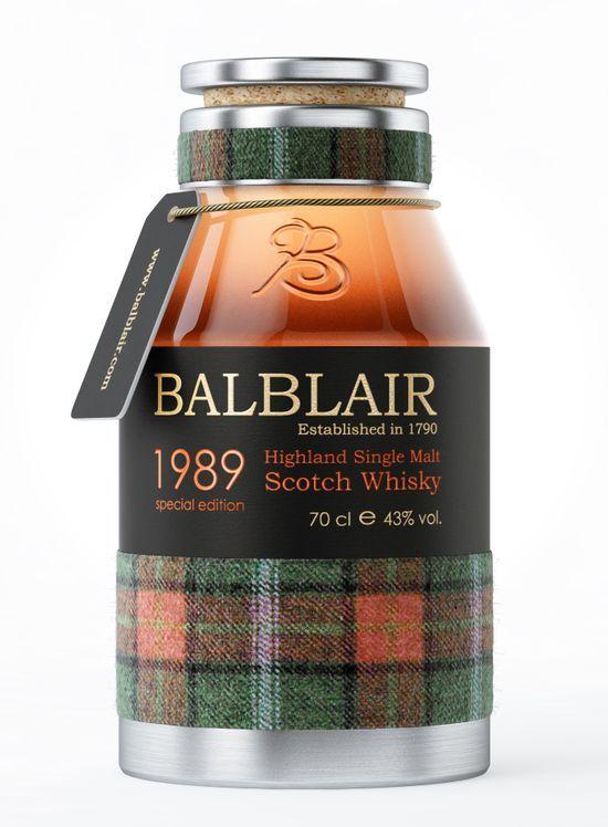
Obviously, quintessentially Scottish or just stating the blatantly obvious? Whichever way you look at it, there is no denying the uniqueness of the Balbair whiskey packaging design here. The decision of the packaging designers to opt for the ‘jam jar’ look of homebrew spirits may seem like a risky move, but the wide mouth is more of a nod to decanted whiskey, and it makes sense that a premium whiskey such as Balbair would be presented in this way.
All in all the design is rather pleasing, and the bluntness of the design approach doesn’t detract from that at all.
Hibiki Whiskey
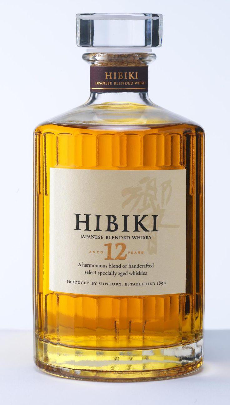
Japan is possibly more known for it’s fishing industry, than its whiskey. Hibiki whiskey is filtered through bamboo charcoal for a unique flavour, that also has a very fruity aroma at the same time.
The name Hibiki, in Japanese, means resonance and this whiskey certainly will resonate with the souls and emotions of even the most discerning of whiskey lovers.
Blended from single malts, and aged in Mizunara (a rare Japanese oak), nothing about this whiskey is anything less than premium. The package designers have opted for a clean, minimal look, so as not to distract from the bottle contents and the clean lines work wonderfully well to accentuate the quality of the product. The detailing cut on the bottle subtly echos the all important bamboo filtering process.
And now just one thing remains for me to do…try each and everyone!