Stag+Seer.
- Web Design/
- Creative Direction/
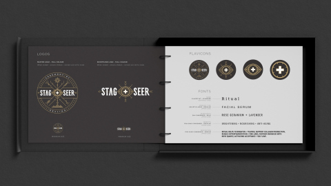
- Identity/
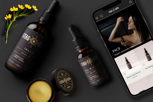
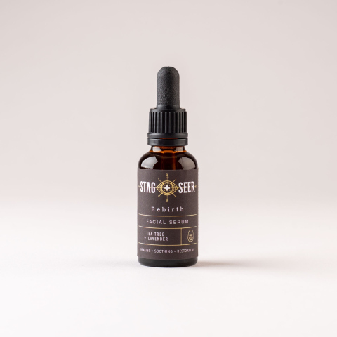
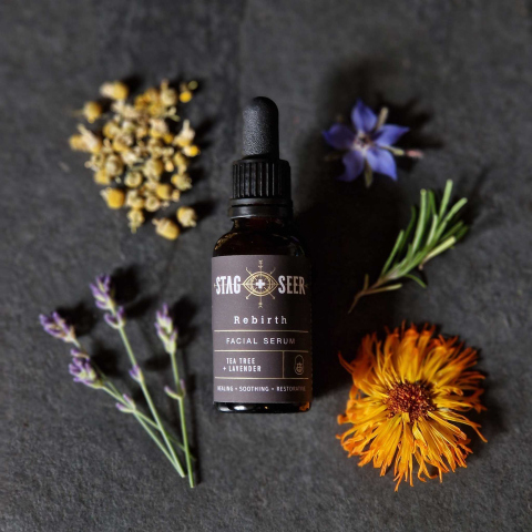
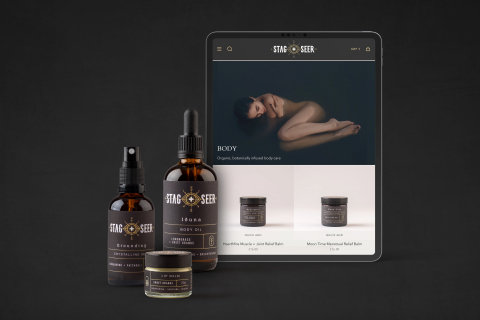
- Packaging Design/
- Branding/
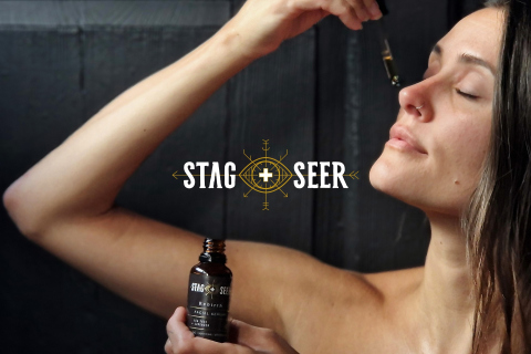
- Photography/
- Brand Strategy
Born out of a deep respect for the natural world, Stag + Seer is on a mission to reconnect people with the healing power of plants and the magic of the great outdoors, by creating products that honour the Earth and nourish the soul.

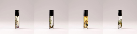
Wildcrafted organic skincare.
The Strategy
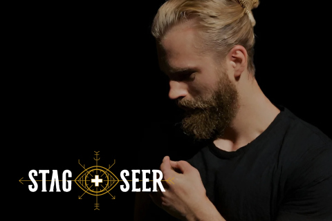
Stag + Seer emerged from a passion for the wild, a love letter to the healing energies found in the embrace of Mother Nature. As we embarked on the journey of recreating the brand, we aimed to encapsulate the very essence that birthed it – a reverence for the natural world.
The Creative
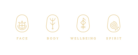
Our redesign delves into the heart of Stag + Seer, seamlessly intertwining runes and symbology inspired by druids and their ancient practices. The visual language is not just a rebrand; it's a tapestry that weaves together the wisdom of the wild with the modern, creating a harmonious blend of tradition and innovation.
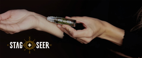
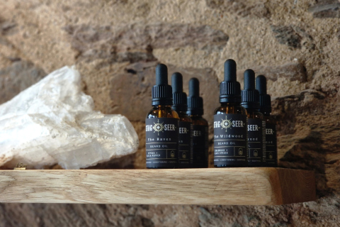
With a large Instagram following attracted to the brand's ritualism, Stag + Seer, an already successful brand, recognised the necessity for its products to stand out on their own. This journey has involved a delicate balance between enchantment and efficacy, evolving the brand's offerings. Rooted in ancient natural wisdom and delivering effective results, the products now exhibit a newfound versatility, maintaining the brand's essence while appealing to a broader audience.

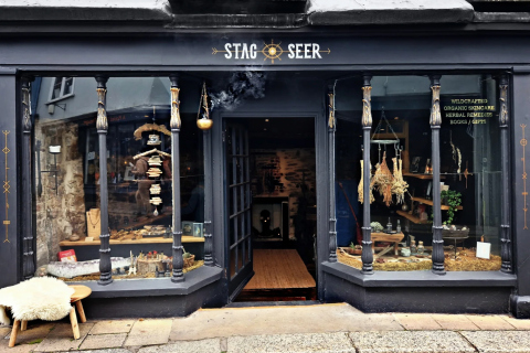
Brick-and-Mortar
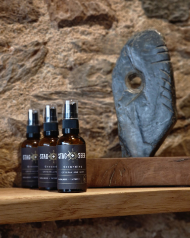
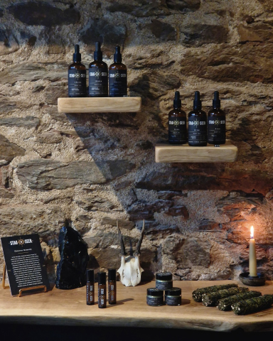
Step into the enchanting store in the heart of Totnes, Devon. Located in the mote of the castle ruins, the space itself breathes history.
Immerse yourself in the visual identity that defines Stag + Seer, meticulously translated throughout the store. Rich interior displays showcase horns, animal skins, and feathers, creating an atmosphere that resonates with the essence of the brand. Welcome to a space where history and modernity intertwine, inviting you to explore the captivating world of Stag + Seer in the charming backdrop of Totnes.
“Working with Landed Creative was a delight; they truly grasped our brand and surpassed our expectations, showing remarkable flair and creativity in delivering a stunning visual identity and web design.
Nat & Dav
Stag+Seer