Brand in the mirror

Branding is a two way conversation.
You’re reading these words on a piece of branding. You’re wearing branding. You’re probably even drinking a piece of branding out of a container of branding. But don’t feel bad. You aren’t being used. Well, not always. Because done well, branding is a two-way conversation. It listens. Adapts. Reflects. Simplifes. Helps. Enhances.
You’re proud to show off a good bit of branding – a label or an icon – because it represents you in some way. You might choose your shoes because they’re comfortable, but also because they demonstrate your values in some way. You might even wear them because of the way the materials are sourced. In this case, the branding is advertising in itself for others to take notice. Yes, they might cost a little more because they’re entirely ethically produced, but there’s a value in values.
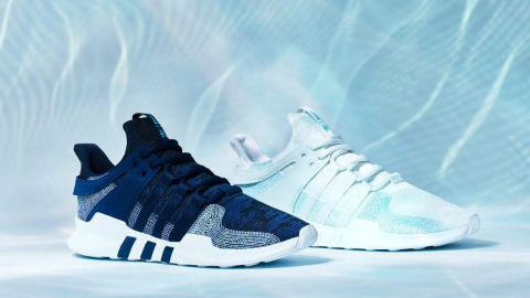
Adidas uses yarns made from ocean waste plastic / source Dezeen.com
Branding & Identity
Taking a step back, when we talk about a brand or branding, we generally mean identity. In the same way that every person is a unique composite of elements, so too is a brand.
A successful brand is built from visual and verbal cues, with each element carefully selected as a signpost to a deeper meaning. Red is never just red. A word is always more than a word.
Colours combine with arrangement. Words mix with typography. Symbols and names build, layer upon layer, constructing something complex that can still appear simple and elegant.
But more than that, there are emotional attachments and associations that go into a brand. Some manufactured, but some truly organic. And each individual can create their own relationship and memories to fuel what that brand means to them personally.
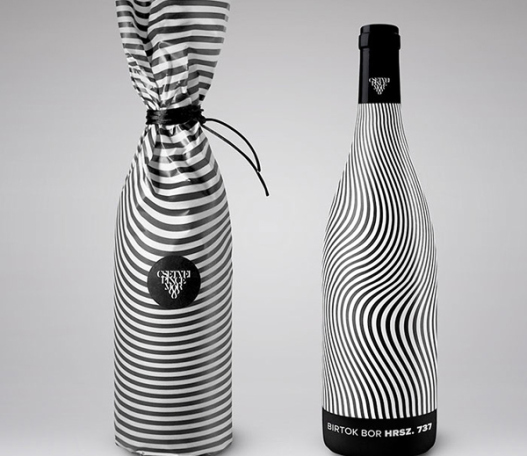
All of this comes together in a variety of places in the world around us. Most obviously on the shelf, where packaging is still the most immediate and tactile distillation of a brand. Yes, the way people buy goods has changed, but fundamentally the beauty and purity of packaging can still make or break a product.
All other communication must then halo and highlight the product, building on its design cues and values into other – predominantly online – spaces. A website is your brand’s new shop window, and the first port of call for most potential new customers. Here’s where your mission statement lives. If your product could talk, here’s where it would say ‘buy me.’ Or rather, ‘why you should buy me.’
Tone of voice.
Brand tone of voice is increasingly important in a world which is heading into a screenless future. Giving your brand a personality sounds simple, but few get it right. It can just take a word here or there, or an illustration, or a timely photo, but every element can build that vital connection with people.
In an increasingly competitive marketplace, it can also create crucial stand-out. And when we know how busy our consumers are, helping them make those split-second decisions is more important than ever.
The modern climate affords brands a further opportunity in the shape of social media. Now brands can more actively exist in and around their customers’ real lives. Personality and voice become more important, and anything other than genuine action can come with grave consequences. Now it’s not enough to talk the talk. You must walk it, but beware the precarious tightrope.
However, the rewards are great, and the way a brand behaves out in the streets can then even feed back into how it looks. Such is the opportunity of this brave new world of design.
The four waves of coffee.
One industry that has constantly evolved and reshaped itself around its customer base is coffee.
Traditionally we talk about coffee in terms of the ‘three waves.’ This goes back to the 1800s to describe the different ways in which the drink has been produced and marketed.
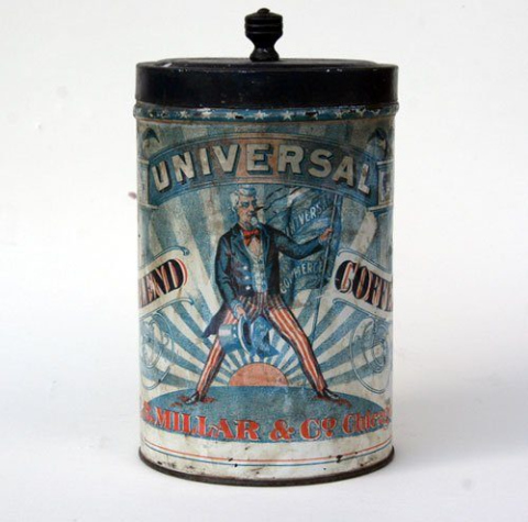
Source / zandkantiques
The first wave describes the growth of coffee consumption globally, from the early 19th century through to around the millenium. For the first time, the beans were made more affordable, and creating a ‘ready for the pot’ product was key. Taste was often sacrificed in favour of convenience and mass-market consumption. The look of the coffee reflected this, with latest technical inventions such as vacuum-sealing and instant grains wagging the design dog. Packaging was essentially nothing more than a delivery method for the desirable substance within. Round one to ‘function.’
Source / Quora
The second wave then tried to shift the focus back on the enjoyment of coffee itself. Specifically the social aspect of it, leading to the rise of the high street coffee shop chains. Here you can see branding reflecting this, with a more communal, lifestyle feel. Spending time with friends was the aspiration; the coffee brands the mere facilitators. If you went off coffee around this time then – put simply – blame Starbucks.
The third wave hit not long after, and refocused the conversation around provenance and the craft of production. Again, this was a reaction to the mass commodification of the product in the previous wave. The packaging took on an artisan look, reflecting more the individual character of the coffee within. Coffee for coffee’s sake wasn’t enough; the ideal was quality coffee. And when that came from Colombia, for example, it came with a story and an identity that people bought just as much as the taste. Here’s where ‘form’ really mounted its comeback, and ‘function’ found itself on the ropes.
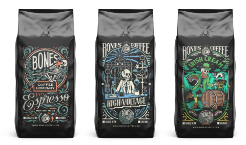
Source / Bones Coffee
We find ourselves now in the fourth wave then. It can be best described as the culmination of all the previous waves, alongside the rise of the independent coffee business. Taste, origin, ingredients, nutrition and ethics all mingle alongside one another in a range of speciality brews that offer consumers the most transparent purchase decision possible. Online ordering and subscription services have further expanded the market, offering every coffee drinker the chance to curate their own experience. Packaging has therefore had to become equally fluid, with bold designs that give consumers the chance to tell their own stories. ‘Form’ and ‘function’ often appear hand-in-hand here, with consumers wanting an experience that’s both thoughtful and also effective.
You could draw the same parallels with many sectors.
Craft Brewers challenge the status quo.
Think of the way beer has changed. We’ve seen waves of national pride propel English beer into homes, followed by inevitable backlashes of premium European imports. There was even a cider uprising. Now, craft and independence is key, with packaging leading the charge for authentic, small batch brewers who were themselves fed up with the status quo. Each product has its own personality and story to tell. And there’s a taste to match every mood.
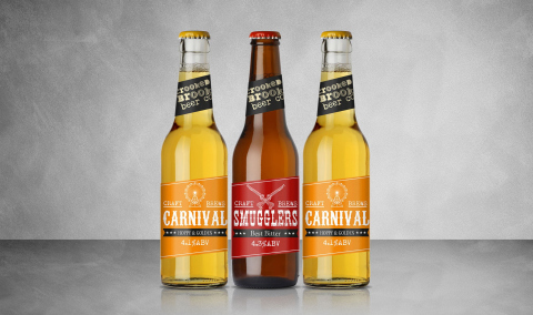
Source / Crooked Brook
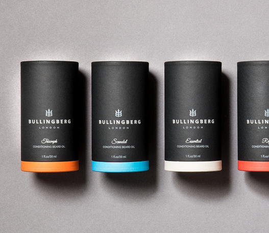
Male skincare uprising.
Men’s personal hygiene is another. ‘Skincare for men’ is no longer a phrase to run and hide from, and beards are now just another fashion accessory. As behaviour changes, so too must the brands that exist in that space. It should go without saying that men want to treat themselves, and luxuriate in premium products that make them feel good, just as much as women. So why, for so many years, did their products look unexciting and cold? Well, no longer. Men’s brands have reacted with stylish, aspirational packaging that better reflects the wider lifestyle of their consumers.
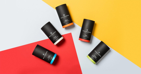
Source / Bullingberg
Packaging from the heart.
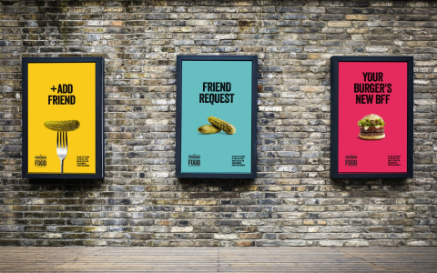
And finally, on-the-go food is now virtually unrecognisable from the sad motorway-service-station packaged sandwich that might appear in your mind’s eye with a shiver. Not only has the range of options expanded dramatically, but also the look of them has moved beyond the merely functional. Colours, imagery, type – all those wonderful aspects of the branding palette – now have to work in overdrive to sell the food and, more importantly, the experience within.
Sushi needs to transport the consumer to the heady neon streets of Tokyo. Pizza has to deliver a slice of that authentic Italy we all aspire to. And if you’re going to sell a singular moment on a tropical island paradise, then you can’t do it inside a drab grey box with a stuffy name scrawled on the outside. It needs to be from the heart, to the heart. Well, to the stomach. But I think we all know the two are connected.
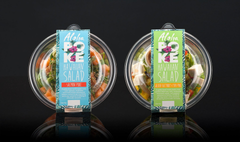
Source / Aloha Poke
Looking to lift your brand?
With over 25 years experience, our branding and packaging designers provide unique creative solutions which balance functionality, information and beauty. We know what it takes to lift a brand, not just aesthetically but commercially too.
Whether you’re big, small, or somewhere in between we can help your brand succeed.
Give us a call to discuss your needs.