MAI Taiko
- Web Design/
- Illustration/
- Creative Direction/
- Identity/
- Packaging Design/
- Photography/
- Content Creation/
- Narrative/
- Brand Design/
- Print Collateral
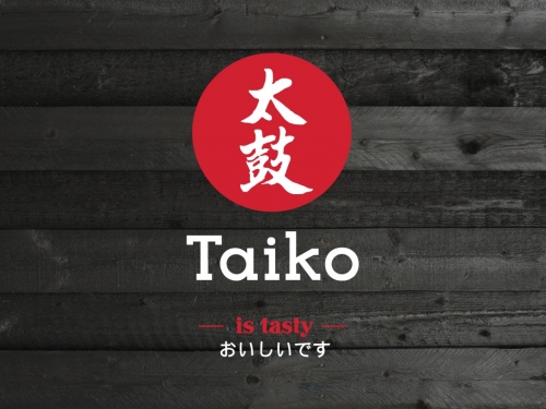
After our successful partnership with Taiko on the launch of their Sushi range, we were approached again to work with them to launch their new sister brand: Mai Taiko.
THE STRATEGY
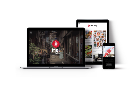
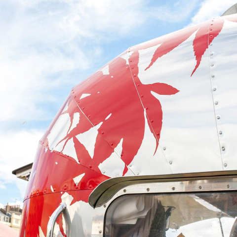
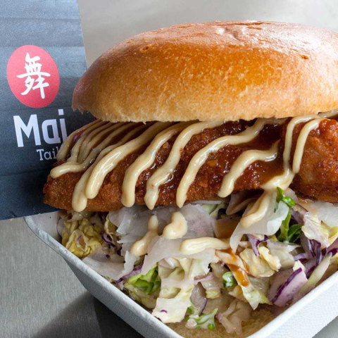
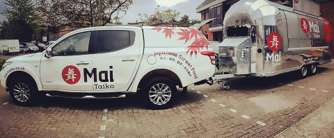
We wanted to build on the work we’d already done for Taiko, and continue to pay homage to Japanese culture, with a slick, modern twist. We knew that whatever we created needed to be flexible enough to sit online, as well as out in the real world on a variety of brochures, stalls, pop-ups, and even on the side of a truck. All of these elements needed their own identity, but also to feel part of a unified whole.
THE CREATIVE
We started with the name. The word ‘Mai’ in Japanese comes from two terms meaning ‘genuine’ and ‘affection,’ which lends itself wonderfully to what we wanted to do with the brand; ground it, and make it for the people. The homophone with ‘my’ in English was the yuzu on the cake.
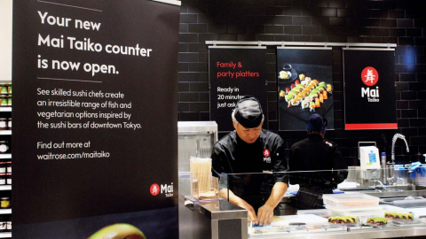
The Waitrose in-store sushi counters became ‘Mai Shop’ and the food truck became ‘Mai Truck,’ whereas at a brand level we were able to write rich copy about the brand’s heritage as ‘Mai Story’ and their mission as ‘Mai Way.’ All the iconography and graphics in-store and on the truck bled authenticity, with clean, precise shapes, and classic, bold colours.
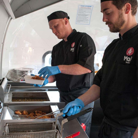
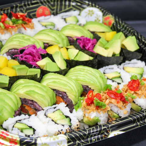
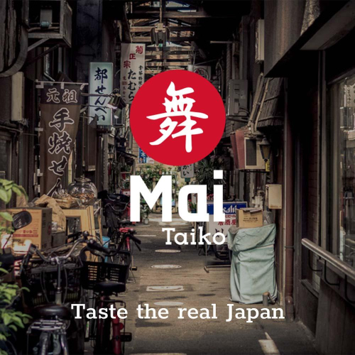
We also developed the brand strapline ‘Taste the real Japan’ as a way of adding to the tradition of the brand. Customers might know Taiko for handy ready-meals, but Mai Taiko was about adding a dash of dashi to what they already loved.
THE OUTCOME
The new Mai Taiko brand is on its way to becoming a cultural phenomenon, with a flourishing social media presence, and customer reviews that show that it isn’t just what’s on the outside that’s a cut above the competition.
