Anchor Foods
- Web Design/
- Illustration/
- Creative Direction/
- Identity/
- Packaging Design/
- Branding/
- Photography
Anchor Catering provide pre-packaged sandwiches for schools, universities, hospitals and other mass markets. They came to us with a rich heritage and long-standing relationships with suppliers, but their brand needed updating. The logo and packaging especially looked tired and old-fashioned; not reflecting the quality produce and manufacturing care that goes into the sandwiches & wraps themselves. They came to us to revitalise the brand and the food packaging in the hope that it would increase sales and help them win new business.

THE STRATEGY
In an increasingly competitive marketplace, Anchor Catering’s outdated branding and packaging was holding them back. They needed a more modern look that better conveyed their artisan, hand-crafted products. They would also benefit from a more premium feel to reflect the fact that even the low-price Anchor sandwiches contain high quality ingredients.
THE CREATIVE
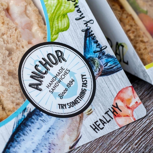
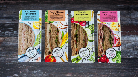
Our first creative challenge was the Anchor brand. Their existing logo was a relic that was only ever intended to be a placeholder, but years later it had stuck. Our new logo better reflects their updated positioning, and sets the tone for everything else that follows. It’s fresh, clean and modern, and still maintains the positive core tenants of an anchor; namely, strength and stability.
Their strapline – Try Something Tasty – adds even more personality in this new logo lock-up, and coupled with the incorporation date, the logo now acts as a stamp of quality.
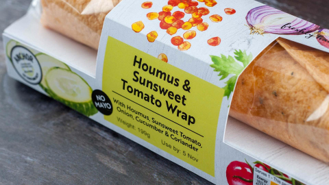
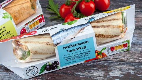
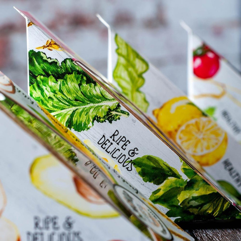
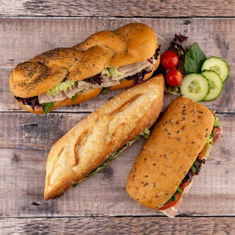
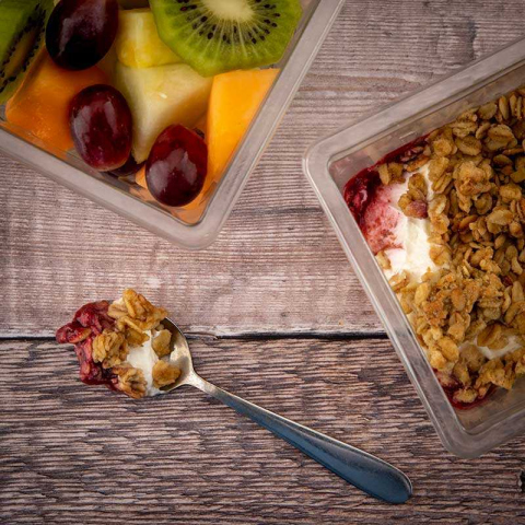
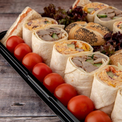
We wanted to capture that inviting feel of the Mediterranean; bright and vibrant colours that jump off the shelf. We paired lush, watercolour illustrations of the ingredients with a whitewashed woodgrain background, adding to the artisan feel. We wanted each pack to feel rustic, hand-crafted and healthy, as well as fresh, natural and delicious. This was certainly followed through with the photography we did for their website
THE OUTCOME
Since our designs have been implemented, Anchor have seen their sales soar. They’ve increased sales by 40%, secured new business and generally taken an even greater slice of the pre-packaged sandwich market. Furthermore, our food packaging design was recently tested in a university focus group, where Anchor sandwiches were ranked as ‘most appealing’ in the market. Pre-rebrand, they had been consistently ranked ‘least appealing.’ The transformation was gloriously complete.