Swell Hair
- Packaging Design/
- Photography/
- Content Creation
We were approached by Swell Hair to redesign their packaging, printed material and POS, with a view to landing their unique three-step haircare system with consumers.

THE STRATEGY
We wanted to build on Swell’s growing reputation within the market, but better land their recommended use of the products. Swell was specifically developed for people with fine, limp and thinning hair, so imparting strength and empowering users was key. We also wanted ‘volume’ to be central in our designs.
THE CREATIVE
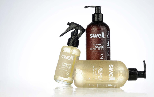
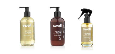
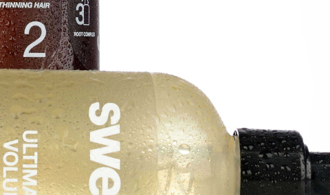
We stripped back everything non-essential to the packaging, making sure that Swell’s unique three-step system really sung. Not only was this easier for consumers to understand, but it also helped to sell the range together. We chose white foil to make sure we got a crisp, clean finish on the bottles. We also drew new key-line icons to help identify individual products, and clearly show where they fit in the three-step system.



Next, we developed secondary packaging to help give the products better standout in-store. The cartons that house the products add a premium sheen that helps immediately attract our target audience.
After the success of the main brand relaunch, we then started work on a new product launch for an Ultimate Protect & Renew Serum and an Ultimate Curl & Bounce Tonic.
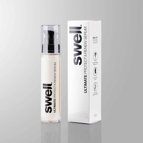
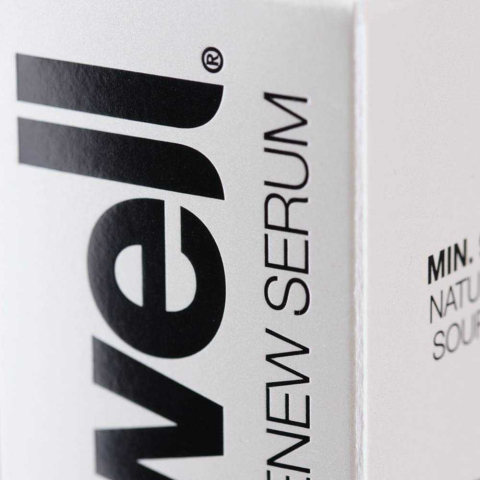
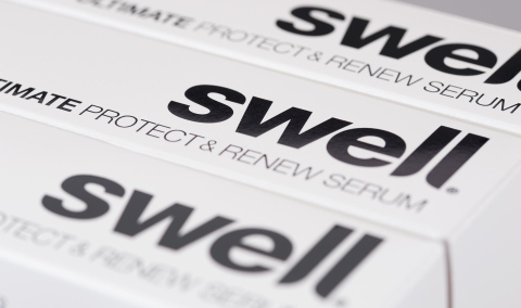
With a higher price point, the Serum needed to shine even more. That’s why we chose to pair GF Smith’s Astralux board with black and silver foil blocking. Using such a luxurious stock in combination with gloss foil attracts more light to the packaging, and gives a sense of movement just like light catching splendid, vibrant hair.
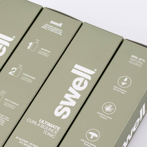
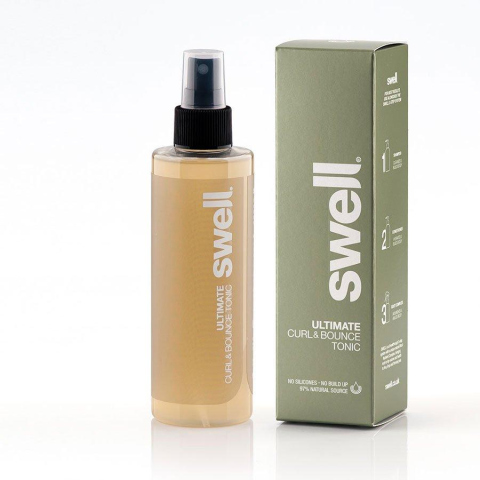
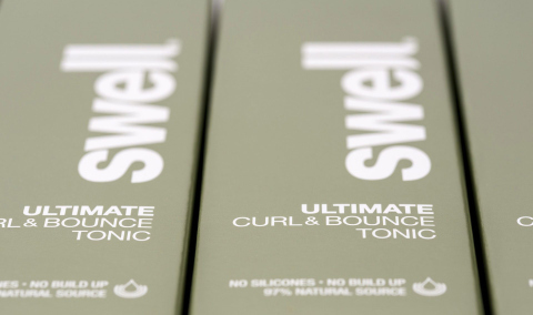
The Bounce Tonic spray is designed to give greater bounce and depth to hair, and so we applied the same approach, to try and mirror that benefit in the packaging itself. We chose a sage green metallic pantone with white-out text and a metallic finish to capture this sense of depth, while still maintaining the simple class of the brand as a whole.
THE OUTCOME
We turned the volume up on sales across the whole range. Swell are now a well-established haircare brand, stocked by trusted online retailers such as Feelunique and Naturisimo, as well as premium high street outlets such as Marks And Spencer.
